Farer Debuts a New Chronograph Collection, the Chrono-Contempo
Each new release from Farer seems to be made to combat the stereotype that British design is dull or humdrum. And with each reference comes an innate understanding of color combinations, setting it apart from similar brands in the market. Their latest collection, the Chrono-Contempo line, might just be the best yet from Farer to showcase the brand?s talents in action.
The Chrono-Contempo collection, released today, has taken inspiration from Farer?s own backyard. The colorways in this collection are the aptly named Chalcot and Portobello, two nods to historic parts of London. Each with its own unique take on contemporary design, the two blend beautifully to create a broader landscape of Farer?s unique eye for color, encompassing vibrant orange, subtle navy, and a shock of mint green.
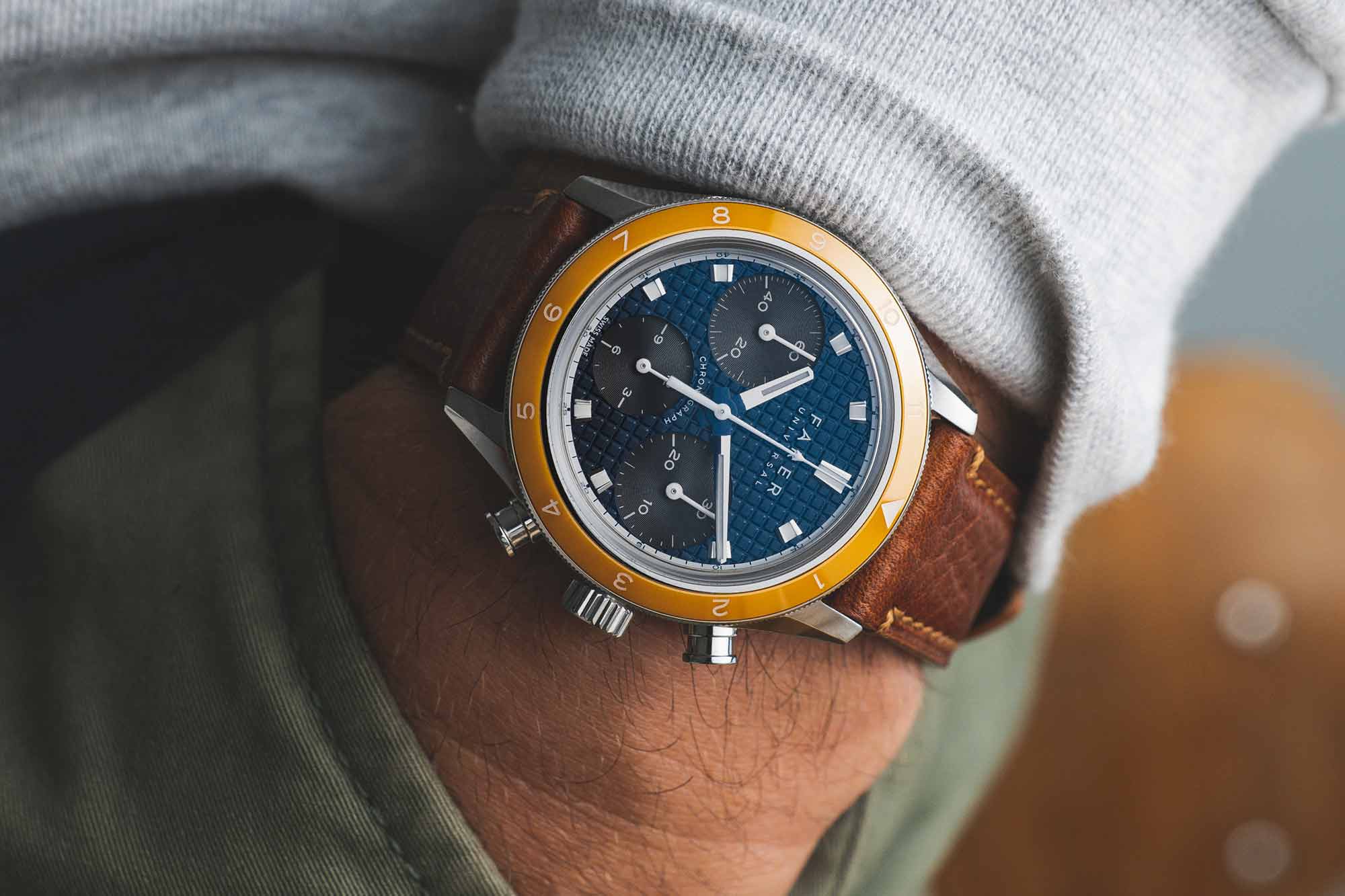
Chalcot, named for the Square right next door to Farer?s HQ, balances big personality in a wearable design. Inspired by the ?Big Eye? chronograph (named for the minute counter being larger than the other subdials), there?s a lot happening on the dial, without ever feeling overwhelming. This is due, in part, to the subtle way in which two of the subdials blend into the mint green backdrop, while the 3 o?clock subdial stands out in white. Further accented by a navy ceramic bezel and orange hands, this watch does Chalcot Square?s characteristic style justice.
Second, there is Portobello. This stretch of London is a bustling, creative, and metropolitan hub and the watch mirrors th...
| -------------------------------- |
|
|

Introducing – The Bremont Terra Nova 40.5 Date Caramel Limited Edition
31-10-2024 04:00 - (
Luxury Watch )