Farer Reveals New Cobb Chronograph In Monopusher Guise
When Farer introduced the Segrave Monopusher over the summer, we speculated that a second colorway would soon follow, given the relative rarity with which the brand releases a singular watch. Today, we get our first look at that second colorway, it?s called the Cobb Monopusher, and like the Segrave, it?s based on a pior release. Here, we?re treated to a typical bright array of colors assigned to a relatively traditional chronograph dial spread, all set within that lovely Farer case.
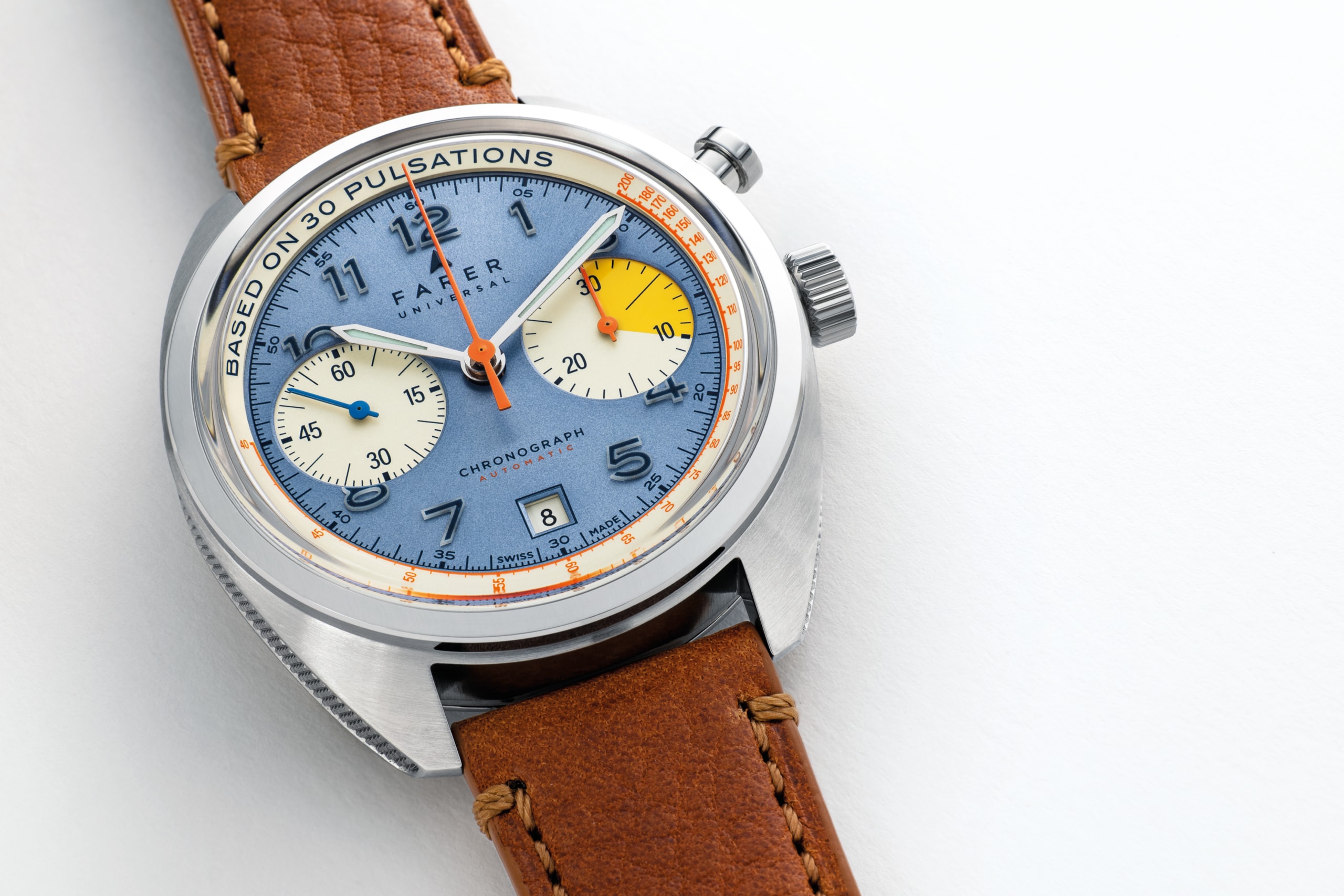
The Cobb Chronograph was first released in 2018 (you can see our video review of the watch right here) sporting a dark blue dial with asymmetrical subdials filled with a range of teals. The timing hands rendered in bright primary colors brought some levity to the arrangement, and made the watch unmistakably Farer.
The Cobb Monopusher offers a different interpretation of this design. Gone is the ?big-eye? layout, replaced by symmetrical cream colored sub dials, with the first ten minutes of the totalizer highlighted in yellow. The base of the dial is a silvery blue with ?torchlight? sunray texture that I get the feeling will not be served justice with mere pictures. Timing hands are rendered in orange, while the running second hand is flat blue. It?s enough color to feel light and playful, but a mature playful.Â
Applied Arabic numerals are solid cast natural white Super-LumiNova infilled with blue ink, and look pretty mean in the dark. Keeping symmetry in check is a date aperture at ...
| -------------------------------- |
|
|

Introducing – The Bremont Terra Nova 40.5 Date Caramel Limited Edition
31-10-2024 04:00 - (
Luxury Watch )